_edited.jpg)
EBTL & THE FARMERS COLLECTIVE
Identity Design • Local Livelihoods • Organic Farming • Forest Restoration • Branding • Packaging Design
Elephants By The Lake (EBTL) is a native forest restoration initiative in Tamil Nadu by the Rainmatter Foundation. In their endeavor to strengthen local livelihoods and stewardship of land, they have brought together a collective of local farmers to develop a sustainable packaged foods business model called Elephants By The Lake & The Farmers Collective. The intended audience comprises of urban buyers who are health and environment conscious.
I was commissioned to create a cohesive visual identity with brand guidelines and a set of labels for their first batch of products.
TIMELINE
April - June 2025
ROLE
ROLE
Researcher and Visual Identity Designer
SPONSOR
Elephants By The Lake (EBTL)
COLLABORATORS
Varun Balakrishnan (Project Manager, EBTL)
Gopana Anil: Product photography, workshop photographs
SKILLS
TOOLS AND SOFTWARE
Primary Research, Storytelling, Ideation, Sketching, Graphic Design
Procreate, Adobe Illustrator
OUTCOMES
Logo set
Visual identity guide with guidelines for usage of logo set, colour palette, typography, icons and layouts
Label designs for 8 products
GLIMPSES OF THE PROCESS
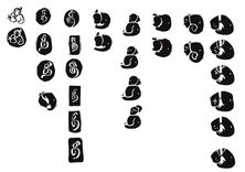
I had the opportunity to visit EBTL and meet the farmers who would be a part of this initiative. As the project lay at the intersection of the forest, the farm, and people, I worked to create options which merged together local elements from the project: a mango (their main offering), the elephant and a woman farmer. One of the early explorations included variations of the Tamil letterform of Thi, standing for 'The' Farmers Collective. After arriving upon the final option, I worked on the logo to make it look stamped or hand-printed with an irregular organic block, combining curvy, uneven strokes to evoke a sense of free-flowing artisanship.

The illustration was inspired by the elements from the space, its flora and fauna, and local environment including elephants, the farmers working in the fields, the nursery with its native plant saplings, the meticulously tested recipes and handpicked organic ingredients. The overall visual treatment was to be crude and uneven looking, similar to a linocut or wood-block print, with irregularities and imperfections.
REFLECTIONS
I've always wanted to work with rooted organisations with a strong social and environmental core. Because this project was to my heart, I diverged a bit too much during the explorations and iterations stage, wanting to ensure I'd explored every single possibility deeply. While this made converging difficult, the process got easier once we shortlisted among dozens of options and finalised a logo. It was rewarding to create variations of it for various contexts and see it come into production as labels, postcards and in brochures.
FURTHER IMPLICATIONS
As the business grows, I look forward to seeing how the robust brand guidebook shapes future designs, including banners, social media presence and other contexts.
In this long-term collaboration, I'm also eager to create more with Elephants By Lake, who are doing some fabulous work out there.


