GAJAH
Identity Design • Haircare • Ayurveda • Wholesome health • Packaging Design
Gajah is a natural haircare brand aiming to restore trust in wholesome hair health through well-researched, kitchen-born remedies rooted in the wisdom of Ayurveda. They approached me with the intent to rebrand to a visual identity that reflected this commitment and the brand's Indian, ayurvedic positioning. I came onboard to create a cohesive visual identity with brand guidelines and packaging labels and boxes for their products.
TIMELINE
April - May 2025
ROLE
ROLE
Brand Visual Strategist and Visual Identity Designer
CLIENT
Gajah, Earthly Secrets LLP
SKILLS
TOOLS AND SOFTWARE
OUTCOMES
Brand Study, Market Research, Storytelling, Ideation, Sketching, Identity Design
Procreate, Adobe Illustrator
Logo set
Visual identity guide with guidelines for usage of logo set, colour palette, typography, icons and layouts
Packaging design including labels and outer boxes for 4 products
GLIMPSES OF THE PROCESS
DISCOVERY AND RESEARCH
At its core, Gajah is committed to offering effective, clean, and nourishing solutions for hairfall, dandruff, and thinning: issues that often feel isolating and unfixable. With a strong stand against hormonal interference from drugs like minoxidil and finasteride, its products are crafted slowly and patiently, to be consistent, honest and restorative. In a crowded market of overstyled promises and synthetic shortcuts, Gajah is set to be a premium, yet grounded alternative. It leans into its kitchen-born authenticity, offering a product that looks and feels like medicine,
but is gentle, tactile, quietly strong and dependable.
Through an elaborate exercise in understanding Gajah’s values, audience, and
long-term vision, I conducted a detailed discovery phase that involved stakeholder interviews, user research, and immersion into the brand's origin story. I also undertook an extensive review of the visual language and positioning of over 11 competitors, spanning Ayurvedic, pharmaceutical, clean beauty, and D2C wellness brands. This helped identify gaps, clichés, and missed opportunities in the current landscape, and sharpen the articulation of Gajah’s unique voice.
DEFINING THE OBJECTIVES
Building upon the research and discovery, I outlined Gajah’s brand objectives, ideal perception, and key messaging themes in their brand strategy. To initiate the visual identity process, I curated multiple moodboards exploring distinct aesthetics, tones, and styles. These served as collaborative tools to align on the brand’s visual direction and emotional resonance before design development began.
CONCEPTS FOR VISUAL IDENTITY
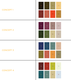
Based on the chosen mood board direction, I presented the client a few concepts which explored typography and the presence of the elephant motif. I also developed another deck with four colour palette options.
DESIGN DEVELOPMENT
With the concept selected, the sketching, tracing, tweaking and aligning began.
At this point, I was also sent the bottle designs being used then. The content would by and large remain the same. The identity had to look clean and modern, but draw heavily from Indian elements.
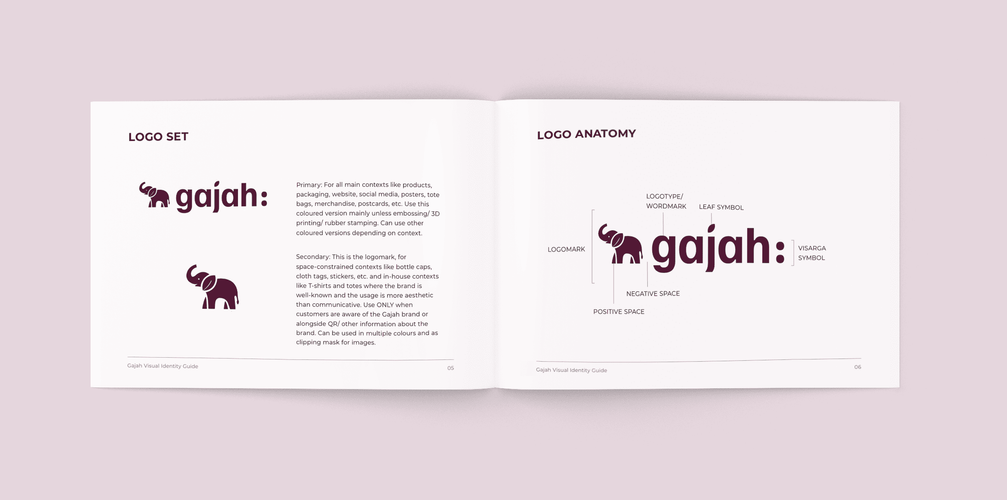
Adapting the existing elephant for the new logo, I drew inspiration from the brand’s values of being pure, premium, natural and friendly. Depicting a stylised elephant with smooth pleasant curves and a leaf forming its ear, it also uses the clean and professional-looking font, Familjen Grotesk. The visarga ( : ) and the leaf are elements which reinforce its Ayurvedic, rooted authenticity and wholistic approach to wellness. The primary logo is earthy purple, exemplifying the premium, high-end nature of the brand. Visually, the logo is designed to be use balanced contours which evoke a sense of the elephant’s strength and wholesomeness through a playful yet sophisticated look.
I also developed an illustration style that best complemented the visual identity, using flat silhouettes with mild gradients. The illustration motifs symbolise strong, radiant hair and the five principles strands of Gajah: pure, wholistic, strengthening, reliable and natural. I built an assets folder containing several variations of these to be scaled, cropped and used to enhance various contexts, including web pages, social media posts and the packaging. The visual identity guide also explained how brand colours could be used to derive different gradients for the motif.


So, here's how it began:
And here's what we ended up with.
REFLECTIONS
One of the most enjoyable parts of the process was developing the new illustration motifs. It gave me space to play, experiment and find fresh visual depiction of hair.
Working on the Gajah rebranding project taught me that rebranding is often more challenging than starting from scratch. It required not just drawing from the research I did but also a deep sensitivity to what already existed as the brand language, the logic behind it, and then working to bring new visual vocabularies to the brand. There is a tendency among those who have built a brand from scratch to grow attached to the older identity and subconsciously want to replicate it in the newer one. Navigating this emotional investment while still pushing for clarity, coherence and evolution demanded both empathy and conviction in my own design choices.
OKAY EXPLORER, PICK YOUR NEXT PORTAL.


